

Last week, as I was working on a project, I found myself working on a design that was using an icon library I wasn’t able to import. I contemplated using Lucide icons for the icons that matched and finding alternatives to the ones I couldn’t find. But later, I decided to export the icons instead.
The challenge was that I needed a way to dynamically change the style of the icon in various states. Then I remembered a previous project where I turned SVGs into React components. This post will show you how easy it is to do.
TL;DR
- Convert your SVG code into a React component by wrapping it in a function
- Use
classNameprop to enable dynamic styling - Replace hardcoded colours with
currentColoror custom color props to allow colour inheritance - Spread additional props to the SVG element for maximum flexibility
- Use the component like any other React component with dynamic classes
Prerequisites
Before we dive in, you should have:
- Basic knowledge of React components
- Understanding of SVG structure
- A React project set up
- An SVG you want to convert
Understanding SVGs in React
SVGs (Scalable Vector Graphics) are perfect for icons and illustrations in React applications because they scale perfectly without losing quality. When working with SVGs in React, you have several options:
- Import them as image files with
<img src="icon.svg" /> - Use an icon library
- Convert them into React components
There are multiple ways to use SVGs in React, but the most flexible and powerful method is to convert them into React components. This allows you to take full advantage of React’s capabilities, such as props, state, and lifecycle methods.
Converting SVGs to React components offers significant advantages:
- You can dynamically change properties like size and colour
- You can add interactions and animations
- Components are reusable across your project
- You maintain better control over the SVG rendering
Converting an SVG into a React Component
In this section, we’ll walk through the process of converting an SVG into a React component.
Step 1: Obtain the SVG Code
First, you need the raw SVG code. You can get this from design tools like Figma, Sketch, or Illustrator, or download icons from icon libraries like Lucide.
For this example, let’s say you have a simple hamburger menu icon:
<svg
  xmlns="http://www.w3.org/2000/svg"
  width="24"
  height="24"
  viewBox="0 0 24 24"
  fill="none"
  stroke="black"
  stroke-width="2"
  stroke-linecap="round"
  stroke-linejoin="round"
  class="lucide lucide-menu-icon lucide-menu"
>
  <line x1="4" x2="20" y1="12" y2="12" />
  <line x1="4" x2="20" y1="6" y2="6" />
  <line x1="4" x2="20" y1="18" y2="18" />
</svg>
Step 2: Create a React Component Structure
Next, create a new React component that will return the SVG:
export const MenuIcon = () => (
  // SVG code will go here
);
Step 3: Insert the SVG Code Inside the Component
Place your SVG code inside the component.
export const MenuIcon = () => (
  <svg
    xmlns="http://www.w3.org/2000/svg"
    width="24"
    height="24"
    viewBox="0 0 24 24"
    fill="none"
    stroke="black"
    stroke-width="2"
    stroke-linecap="round"
    stroke-linejoin="round"
  >
    <line x1="4" x2="20" y1="12" y2="12" />
    <line x1="4" x2="20" y1="6" y2="6" />
    <line x1="4" x2="20" y1="18" y2="18" />
  </svg>
);
Step 4: Make the SVG Dynamically Stylable with Props
To make our SVG component flexible, we’ll accept props, particularly className for styling:
export const MenuIcon = ({ className, ...props }) => (
  <svg
    className={className}
    xmlns="http://www.w3.org/2000/svg"
    width="24"
    height="24"
    viewBox="0 0 24 24"
    fill="none"
    stroke="black"
    stroke-width="2"
    stroke-linecap="round"
    stroke-linejoin="round"
    {...props}
  >
    <line x1="4" x2="20" y1="12" y2="12" />
    <line x1="4" x2="20" y1="6" y2="6" />
    <line x1="4" x2="20" y1="18" y2="18" />
  </svg>
);
Here, we’re:
- Destructuring
classNamefrom props - Using the spread operator
{...props}to pass any additional props to the SVG - Adding the
classNameto the SVG element
Step 5: Use currentColor for Dynamic Colour Changes
For maximum flexibility, replace hardcoded colour values with currentColor:
export const MenuIcon = ({ className, ...props }) => (
  <svg
    className={className}
    xmlns="http://www.w3.org/2000/svg"
    width="24"
    height="24"
    viewBox="0 0 24 24"
    fill="none"
    stroke="currentColor" // Changed from "black" to "currentColor"
    stroke-width="2"
    stroke-linecap="round"
    stroke-linejoin="round"
    {...props}
  >
    <line x1="4" x2="20" y1="12" y2="12" />
    <line x1="4" x2="20" y1="6" y2="6" />
    <line x1="4" x2="20" y1="18" y2="18" />
  </svg>
);
Using currentColor allows the SVG to inherit the text colour from its parent element through CSS, making it incredibly versatile.
How to Use the SVG Component
Now that we’ve created our SVG component, we can use it like any other React component:
export default function IconDemo() {
  return (
    <div className="flex items-center gap-4">
      {/* Basic usage */}
      <MenuIcon />
      {/* With hover effect */}
      <MenuIcon className="transition hover:text-blue-500" />
      {/* Different size and colour */}
      <MenuIcon className="h-14 w-14 text-green-600" />
    </div>
  );
}
In this example, we’re using Tailwind CSS classes to style the SVG. You can easily change the size, colour, and hover effects by modifying the className prop.

Advanced Techniques
Handling Multiple Colours
SVGs often contain multiple elements with different colours. Here are progressive approaches to handle these cases:
1. Basic Approach: Using Individual Colour Props
For SVGs with just a few different coloured elements:
export const MultiColourIcon = ({
  className,
  primaryColour,
  secondaryColour,
  ...props
}) => (
  <svg
    className={className}
    viewBox="0 0 24 24"
    fill="none"
    xmlns="http://www.w3.org/2000/svg"
    {...props}
  >
    <line
      x1="4"
      x2="20"
      y1="12"
      y2="12"
      stroke={primaryColour || "currentColor"}
    />
    <line
      x1="4"
      x2="20"
      y1="6"
      y2="6"
      stroke={secondaryColour || "currentColor"}
    />
    <line x1="4" x2="20" y1="18" y2="18" stroke="currentColor" />
  </svg>
);

// Usage with multiple colours
export default function IconDemo() {
  return (
    <div className="flex items-center gap-4">
      <MultiColourIcon
        primaryColour="red"
        secondaryColour="blue"
        className="h-10 w-10"
      />
    </div>
  );
}
In this example, we added primaryColour and secondaryColour props to allow customisation of specific elements. This is useful for SVGs with only a few colourable parts.

2. Advanced Approach: Using a Colours Object
For complex SVGs with many coloured elements, a more scalable approach uses a colours object:
export const ComplexIcon = ({ className, colours = {}, ...props }) => {
  // Default colours that will be used if not overridden
  const defaultColours = {
    primary: "currentColor",
    secondary: "currentColor",
    accent: "#FF5733",
    background: "transparent",
    outline: "#333333",
    // Add more as needed
  };

  // Merge default colours with provided colours
  const mergedColours = { ...defaultColours, ...colours };

  return (
    <svg
      className={className}
      viewBox="0 0 24 24"
      xmlns="http://www.w3.org/2000/svg"
      {...props}
    >
      {/* Background rectangle */}
      <rect
        x="0"
        y="0"
        width="24"
        height="24"
        fill={mergedColours.background}
      />

      {/* Primary elements */}
      <path
        d="M5 3h14v2H5V3z"
        fill={mergedColours.primary}
        stroke={mergedColours.outline}
      />

      {/* Secondary elements */}
      <path d="M3 21h18v-2H3v2z" fill={mergedColours.secondary} />

      {/* Accent elements */}
      <path d="M5 16h14v-2H5v2z" fill={mergedColours.accent} />
    </svg>
  );
};

// Usage examples
export default function ComplexIconDemo() {
  return (
    <div className="flex gap-4">
      {/* Using default colours with class-based text colour */}
      <ComplexIcon className="h-8 w-8 text-blue-500" />

      {/* Customising specific colours */}
      <ComplexIcon
        className="h-8 w-8"
        colours={{
          primary: "#FF0000", // Red
          secondary: "#00FF00", // Green
          accent: "#0000FF", // Blue
        }}
      />

      {/* Complete colour scheme override */}
      <ComplexIcon
        className="h-8 w-8"
        colours={{
          primary: "#E91E63", // Pink
          secondary: "#9C27B0", // Purple
          accent: "#673AB7", // Deep Purple
          background: "#F5F5F5", // Light grey background
          outline: "#212121", // Dark outline
        }}
      />
    </div>
  );
}
This approach provides several advantages:
- Default colours can be established but easily overridden
- Colour schemes can be defined once and reused across multiple icons
- The component remains clean even with many colourable elements
- You can set theme-specific colour schemes throughout your application
Animating SVG Components
You can animate SVG components using CSS transitions or React animation libraries:
export const LoaderIcon = ({ className, ...props }) => (
  <svg
    className={className}
    xmlns="http://www.w3.org/2000/svg"
    width="24"
    height="24"
    viewBox="0 0 24 24"
    fill="none"
    stroke="currentColor"
    stroke-width="2"
    stroke-linecap="round"
    stroke-linejoin="round"
    {...props}
  >
    <path d="M21 12a9 9 0 1 1-6.219-8.56" />
  </svg>
);

// Usage with animation
export default function LoaderDemo() {
  return (
    <div className="flex h-screen items-center justify-center">
      <LoaderIcon className="animate-spin text-blue-500" />
    </div>
  );
}
In this example, we use the animate-spin class from Tailwind CSS to create a spinning loader icon. You can also use CSS keyframes or libraries like Framer Motion for more complex animations.
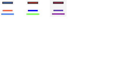
Figure 4: Animated SVG loader icon demonstrating the use of CSS animations.
Using SVG Components in Next.js
The approach works perfectly in Next.js applications as well. For optimal usage in Next.js, you might want to place your SVG components in a dedicated directory like components/icons/.
Common Issues and Troubleshooting
React SVG Icon Not Showing/Rendering
If your SVG component isn’t rendering at all, there are several common causes to check. Understanding how to debug React applications can help you systematically identify and fix these issues:
- JSX attribute naming: SVG attributes in React need to use camelCase instead of kebab-case. For example:
// Incorrect (kebab-case)
<svg stroke-width="2" stroke-linecap="round">

// Correct (camelCase)
<svg strokeWidth="2" strokeLinecap="round">- Missing closing tags: Make sure all SVG elements have closing tags or are self-closing:
// Incorrect
<path d="M5 3h14v2H5V3z">

// Correct
<path d="M5 3h14v2H5V3z" />- SVG namespace issues: Ensure the SVG has the correct namespace:
<svg xmlns="http://www.w3.org/2000/svg" ... >- Invalid viewBox: Check that the viewBox attribute has valid values (four numbers separated by spaces):
// Correct
viewBox = "0 0 24 24";-
CSS override: Check if any CSS is setting
display: noneorvisibility: hiddenon your SVG. -
Incorrect path data: Verify that path data strings are properly formatted with no syntax errors.
// Example of properly formatted path data
<path d="M5 3h14v2H5V3z" />- Missing return statement: Ensure you’re actually returning the SVG from your component:
// Incorrect (no return)
export const MenuIcon = ({ className, ...props }) => {
  <svg className={className} viewBox="0 0 24 24" {...props}>
    <path d="M5 3h14v2H5V3z" />
  </svg>;
};

// Correct (with return)
export const MenuIcon = ({ className, ...props }) => {
  return (
    <svg className={className} viewBox="0 0 24 24" {...props}>
      <path d="M5 3h14v2H5V3z" />
    </svg>
  );
};

// Also correct (implicit return with parentheses)
export const MenuIcon = ({ className, ...props }) => (
  <svg className={className} viewBox="0 0 24 24" {...props}>
    <path d="M5 3h14v2H5V3z" />
  </svg>
);- Incorrect import/export: Ensure you’re importing and exporting the component correctly in your files.
// Importing
import { MenuIcon } from "./MenuIcon";
// Exporting
export { MenuIcon };
SVG Not Scaling Properly
If your SVG doesn’t scale correctly with the classes you provide, check if the width and height attributes are overriding your CSS. You can remove these attributes and rely solely on the viewBox:
// Before
<svg
  className={className}
  xmlns="http://www.w3.org/2000/svg"
  width="24"
  height="24"
  viewBox="0 0 24 24"
  fill="currentColor"
  {...props}>
  {/* paths */}
</svg>

// After
<svg
  className={className}
  xmlns="http://www.w3.org/2000/svg"
  viewBox="0 0 24 24"
  fill="currentColor"
  {...props}>
  {/* paths */}
</svg>
Alternative Methods
While manual conversion is straightforward for simple SVGs, there are tools that can help automate the process, especially for complex icons or when dealing with many SVGs:
- SvgViewer - A tool to convert SVGs to different formats: SVG Viewer
- SVGR - Another tool that converts SVGs into React components: SVGR Playground
These tools are especially helpful when working with complex SVGs or when you need to convert a large number of icons at once.
If this article helped you, leave a comment below and share it — it might
help someone else too!
Got thoughts or questions? Lets connect on
X or
LinkedIn.
Till next time, happy coding! 😊

Useful Resources
- What is SVG? - A comprehensive guide on SVGs from MDN Web Docs.
- How to Use SVGs in React - A detailed guide on using SVGs in React applications.
- Learn Several Ways to Import SVG Images in React - Explore different approaches to importing SVGs in React.
- How to Create an Image Slider Using CSS and JavaScript - A tutorial on creating an image slider with CSS and JavaScript.
Frequently Asked Questions
1. How do I animate SVG components in React?
You can animate SVG components using CSS animations, transitions, or libraries like Framer Motion. For simple animations, Tailwind CSS classes like animate-spin or animate-pulse work well.
2. Can I convert multiple SVGs at once?
Yes, tools like SVGR allow batch conversion of SVG files to React components. This is particularly useful when working with icon sets.
3. How do I handle SVGs with multiple colours?
For SVGs with multiple colours, you can either:
- Replace all colours with
currentColorif you want them to change together - Add specific props for each colour you want to control separately
- Use a colours object to manage multiple colour elements systematically
4. Is there any performance impact?
Using SVGs as React components is generally performance-friendly. However, very complex SVGs with many paths might impact performance. In such cases, consider optimising your SVGs using tools like SVGO.