The image-set() is a CSS function that allows web developers to turn an image into a responsive image, showing variations of the same photo for different screen resolutions when needed. It is almost the same as the HTML srcset attribute for img tags.
In this article, we will learn about responsive images, how to use the image-set() function to create them, why you should make your images responsive, and the difference between the image-set() function and srcset attribute.
What are Responsive Images?
Simply put, Responsive images display the information they are intended to on the user’s web browser regardless of the screen size, screen pixel resolution, or bandwidth/network of the user. This is to say, these images automatically adjust themselves to fit the size of the user’s screen and load according to the resolution of the user’s screen. This improves the user experience as images load fast and look crisp to the human eye.
Why Responsive Images?
Why not? Here are three essential reasons why we should always make our web images responsive;
- To render high-quality images on different devices(also known as resolution switching)
- To load the right images on different screen sizes(also known as art direction)
- For faster loading of web pages
Let’s discuss a little about each of them.
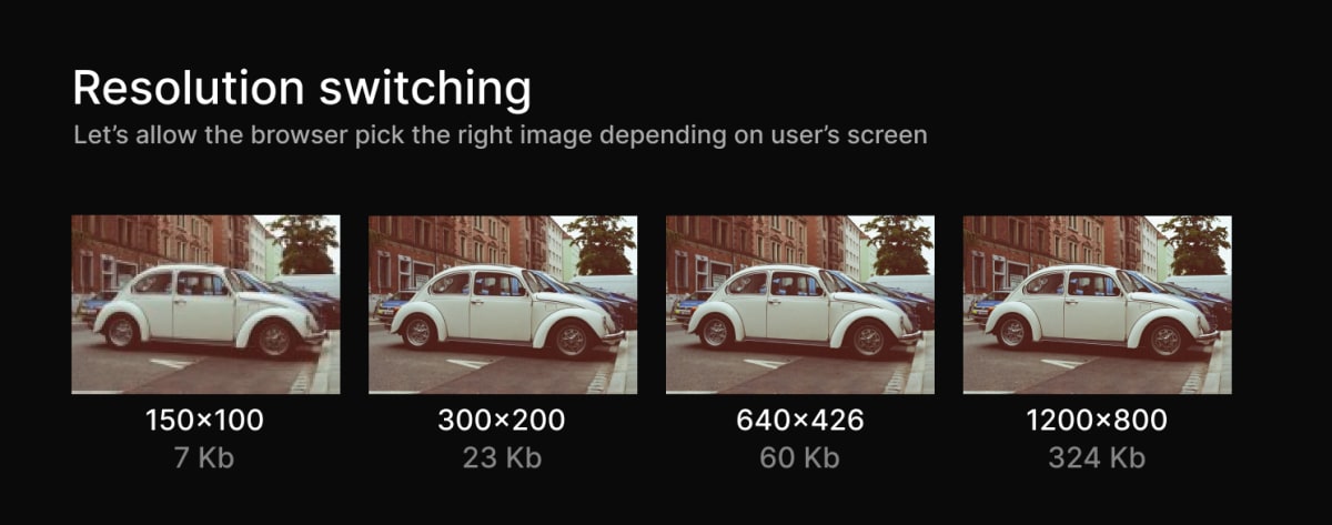
1. Resolution switching: Render high-quality images on different devices
A digital screen(computer, tablet, mobile phone) uses pixels to display images. These pixels are arranged horizontally and vertically in a grid. The number of pixels horizontally and vertically is known as the screen resolution.
For example, a screen with a 1024 x 768 screen resolution means that the screen has 1024 pixels horizontally and 768 pixels vertically. An image with a 1024 x 768 pixels screen resolution also has 1024 pixels horizontally and 768 pixels vertically, with the same width and height.
Still, the image would be stretched on a screen with a 2048x1536 pixel screen resolution because the screen’s width and height are more significant, and you are showing fewer pixels in a larger space. This is due to the different pixel densities of the screen. So on a smaller screen, the image will look sharper because you are showing many pixels in a smaller space.
Image pixel resolutions also partly determine the image size, and the size of an image can affect how fast a browser loads a web page and the amount of data the user uses to download it. For example, a 150 x 100 px resolution image worth 17.7kb would load faster and save internet data than a 3500 x 2321 px resolution image worth 2.4Mb. Therefore, smaller images should also be used on smaller screens where possible.
You can view the live example and play with the source code to better understand Resolution switching.
2. Loading the right images on different screen sizes - Art direction
We know additional images are displayed differently on various screen sizes. However, art direction focuses on the detail of the image content shown to the user, not the image resolution. Art direction might not matter for images that don’t pass any information to the user, but it counts for images that give the user information.
For example, we can have a landscape orientation image with a lady standing at the center of the image as the primary focus. We can easily view the lady’s face on large screens. However, if we are to let the image have the same aspect ratio and orientation on smaller screens, we won’t be able to view the lady easily, let alone her face.
But if we were to crop the image, thereby changing its aspect ratio and letting it have a portrait orientation, we get to view her clearly on smaller screens. But when we switch back to larger screens with the new image, it becomes too big.

Art direction ensures that regardless of the screen size, the user has smooth access to whatever details or content they are supposed to get from an image.
You can view the live example and play with the source code for a more practical understanding of Art direction.
3. For faster loading of web pages
Nowadays, people tend to access the internet through their mobile devices, so it is essential to consider this when adding images to your web pages.
Users should not have to download overly large images for their mobile screens or wait for larger images to load if they have slow internet. Instead, you should be able to provide a means for them to have access to images suitable for their screen sizes and internet connection. This reduces the time it takes for the web pages to load, the user’s bandwidth and money, and overall improves the user experience of your website.
What is the image-set() function?
As I said earlier, the image-set() function is a CSS function that allows web developers to turn an image into a responsive image, showing variations of the same photo for different screen resolutions when needed. And from what we have just learned about the what and why of responsive images, the image-set() function allows us to create responsive images easily.
We list a set of images within the image-set() function. The browsers can pick the most appropriate image from this list for different screen resolutions, with the assurance that the browser would make the best decision about which one to use.
How to use image-set() to create responsive images
The Syntax
image-set() = image-set( ‘image’ ”resolution’ type())
- The image represents the URL to where the image is stored. It is compulsory.
- The resolution represents resolution units, x or dppx, for dots per pixel unit, dpi, for dots per inch, and dpcm for dots per centimeter. Every image within an image-set() must have a unique resolution. It is optional.
- The type() specifies the image’s file format–JPEG, PNG, GIF, AVIF, etc. It is optional.
Example 1
.div {
  background-image: -webkit-image-set(
    url("small-car.jpeg") 1x,

    url("large-car.jpeg") 2x
  );

  background-image: image-set(
    url("small-car.jpeg") 1x,

    url("large-car.jpeg") 2x
  );
}
In example 1, 1x(1 dot per pixel unit) identifies the image the browser should use if the image resolution is higher or matches the screen, making the pixel density equal to 1. If the image resolution is lower than the screen’s, the 2x image should be used. You can add more images if you want to.
Also, a fallback can be added so browsers not supporting image-set() can have an image to fall back on. We add the fallback before the background-image property with the image-set() function.
.div {
  background-image: url("small-car.jpg"); /* fallback */

  background-image: -webkit-image-set(
    url("small-car.jpeg") 1x,

    url("large-car.jpeg") 2x
  );

  background-image: image-set(
    url("small-car.jpeg") 1x,

    url("large-car.jpeg") 2x
  );
}
Example 2
.div {
  background-image: -webkit-image-set(
    url("car.avif") type("image/avif"),
    url("car.jpeg") type("image/jpeg")
  );

  background-image: image-set(
    url("car.avif") type("image/avif"),
    url("car.jpeg") type("image/jpeg")
  );
}
For example 2, we have specified two format types for the same image; avif and jpeg. The widely supported format should always come last, in this case, the jpeg, while the newer formats should go before it.
The browser will download only one image. It checks the first image specified and uses it if it supports it. If it doesn’t, it ignores it and moves on to the next.
Example 3
.div {
  background-image: -webkit-image-set(
    url("small-car.avif") type("image/avif") 1x,

    url("large-car.avif") type("image/avif") 2x,

    url("small-car.jpeg") type("image/jpeg") 1x,

    url("large-car.jpeg") type("image/jpeg") 2x
  );

  background-image: image-set(
    url("small-car.avif") type("image/avif") 1x,

    url("large-car.avif") type("image/avif") 2x,

    url("small-car.jpeg") type("image/jpeg") 1x,

    url("large-car.jpeg") type("image/jpeg") 2x
  );
}
For example3, we specify the resolution along with the image format. This gives the browser even more variations on which image to use.
How does the image-set() function differs from the srcset attribute?
Although the image-set() function and the srcset attribute set out to do the same thing: to help us make our images responsive, there are a few differences between them.
The significant difference is that CSS files use the image-set() function, and Html files use the srcset attribute.
Another difference is that unlike with the srcset attribute, where you can also give image options based on the width of the browser(when Art direction is required), you cannot do that with the image-set(). However, Art direction can still be achieved in CSS using media queries.
View the live example on responsive images going the resolution switching way and the art direction way and play with the source code.
Conclusion
Responsive images are vital in creating a good user experience and building faster web pages. We now better understand what a responsive image should be and how to make better-performance images with the image-set() CSS function.